Communication of scientific information and data to the public is part of NOAA’s mission, and scientific visualization is often the public’s first encounter with the agency’s data. As such, adopting modern visualization design guidelines is important. Commonly, color choices for satellite data have been based on convention without careful consideration of the best colors for conveying information. This post gives an overview of recent advances and considerations for selecting and improving color selection for remote sensing data. NOAA CoastWatch will be experimenting with different colors for its data presentations.
How to Choose The Right Color Bar
Sequential Color Bar
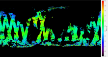
The colors of the map are vital to the representation of the data and the understanding of the consumer. For certain visual variables, such as color and orientation, color is usually king. It is usually the first thing people notice. They don’t notice other variables right away. For example, if you were to display sea surface salinity (SSS) for a specific period or time, you might choose a rainbow color pattern because it is appealing to the eye, gets the information across, and visualizes drastic changes. Figure 1 demonstrates the typical rainbow coloration used for surface surface salinity.

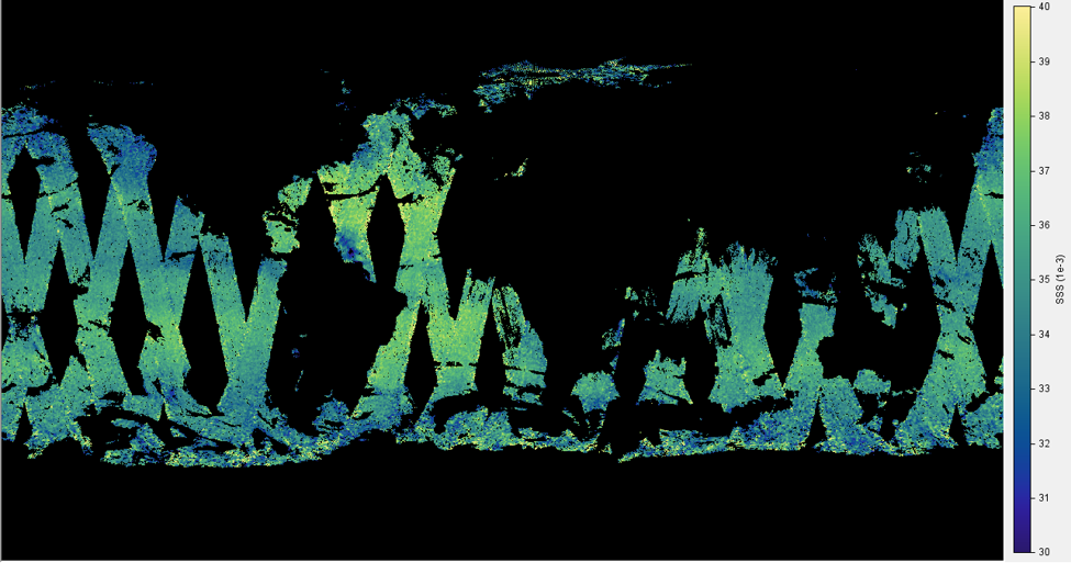
As Figure 1 demonstrates, the rainbow color pattern is mainly used for eye appeal and to display drastic changes. However, this creates an increased rate of error when identifying the highest and lowest data values. To better represent the data, a sequential color bar should be used. A sequential color bar consists of either grayscale or haline maps. These color styles have a greater change in hue. Changes in hue imply more difference than changes in value or intensity. For example, this type of visualization would allow for easier identification of areas that have the highest and lowest surface sea salinity. This color style is represented in Figure 2. See if you can tell the difference!
Diverging Color Bar
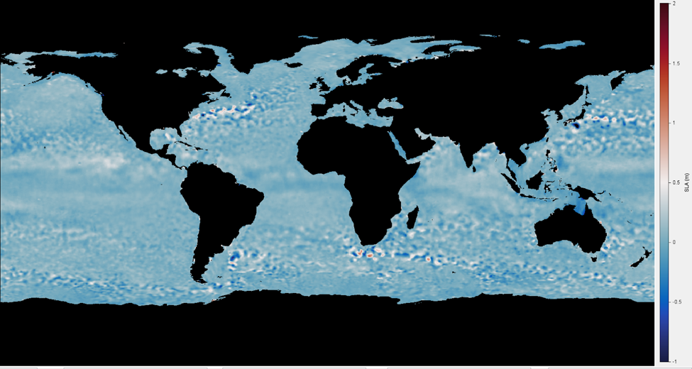
Diverging color bars are useful for displaying anomalies, such as sea surface temperature (SST) and sea surface height (SSH). SSH anomalies visualizes changes in SSH over a certain period of time (usually a month or year). Anomaly maps visualize small ranges of data making it important to make a color bar to visually distinguish small changes. An example of a diverging color bar is red → blue or blue → red.
Below, Figure 3 demonstrates how not to visualize anomalies. The contrast between the colors are best for gradual changes in hue, however, for this type of data, the changes are so small that they aren’t gradual enough for someone to notice a significant difference.
Meanwhile, Figure 4 demonstrates how to properly visualize anomalies. While most of the picture is blue, the areas with large anomalies are easily identifiable in red.
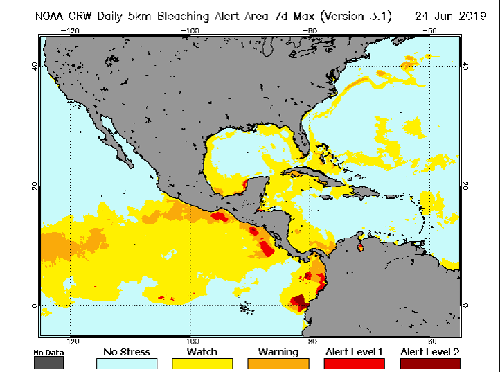
For the public to really understand what they are visualizing, it is best to keep maps and legends simple. As demonstrated above, a continuous data legend should be used if your data is on a constant gradient. Categorical data legends are best used to display different classifications of data (such as no risk, moderate, severe, etc). This type of data is simple to understand and users can quickly grasp the information. This is best used for displaying data such as sea surface temperature (SST) or any of the examples discussed above. Figure 5 demonstrates how NOAA Coral Reef Watch was able to effectively simplify their color bar legend so it is easy to understand.
References and Related Readings
- Gerst, M.D., M.A. Kenney, A.E. Baer, A. Speciale, J.F. Wolfinger, J. Gottschalck, S. Handel, M. Rosencrans, and D. Dewitt. Using visualization science to improve expert and public understanding of probabilistic temperature and precipitation outlooks. Submitted to Weather Climate and Society.
- Thyng, K., Greene, C., Hetland, R., Zimmerle, H., & Dimarco, S. (2016). True Colors of Oceanography: Guidelines for Effective and Accurate Colormap Selection. Oceanography,29(3), 9-13.